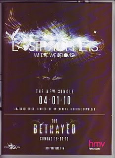
The contrast between colours in the advertisement creates a dramatic effect as the harsh black background illuminates the stark white text. The use of black conforms to stereotypes and conventions associated with the genre of the music which will attract listeners of the genre. The only other colour used is on the HMV logo which is bright pink and stands out, this is partly because it is a company logo and can not be changed but it could also be argued that the endorsement of such a big company enhances the product and also helps show that the product being advertised is an album.
The context within the advertisement is minimalist and simplistic but provides the vital information in order to advertise
the product. The most eye-catching information is the band name and title of the album which immediately draws the attention of the reader. This not only stands out through use of colour but also through the arti
 stic typography which shows images of birds and wings.
This imagery is significant to the band as it is a reo
Other information displayed in the advertisement is the release date of the single which is in large writing so the important information is easily absorbed, above this in smaller writing is the description of the product (the new single), this makes the information very clear to understand and leaves no room for misinterpretation. This could also be displayed because the bands album is also advertised on the same page and by writing this above the date it is clear that it is in relation to the single. Another way the single and the album information is clearly separated is by a single white line which splits the information into two halves and is shown almost as a subtitle giving the main priority to the single. Displaying the two products on the same advert is cost effective as it saves the need for a second advertisement which would be very expensive.
The layout of the advertisement is visually pleasing not only due to the text and separation of the page but also because of the simplistic appearance and empty spaces. These blank areas could be seen as a waste of space, however they make the information easy to absorb as the reader is not bombarded with clutter and useless information.
Overall I think this advertisement is suited to its target market due to the overall appearance and the magazine it is featured in. I think the main success is that the information is ‘to the point’ which makes the reader more willing to absorb it. This is something I will consider when making my own magazine advertisement.
No comments:
Post a Comment