In total I have surveyed 30 people at random whilst trying to get an even mix of genders. I feel I now have enough information to analyse and consider whilst planning my products. I marked anyone over the age of 26 in red and I will review this data but not let it influence any decisions I make for my product.
Age: I surveyed 25 people between the ages of 16 and 25 and 5 people over the age of 26, this gives me 25 people within my target audience which is a large enough data base to get an idea of what the consumer wants.
Gender: Having managed to get a 50/50 mix of males and females my data should not be bias to any gender.
Genre: The two most popular genres of music were ‘pop chart’ and ‘indie’. Pop received 8 votes (2 from over 26’s) whilst ‘indie’ gained 10. I was considering an indie song choice which is now justified as it seems a popular amongst my target age group. Another genre I was considering was R&B, however this only received 2 votes so I wouldn’t be appealing to a wide enough consumer group.
Time spent watching music videos: The results from this question surprised me as I predicted that most people would watch under an hour a week as they usually last no longer than 5 minutes but it would appear to be a regular activity for most participants I asked the majority of people said they watched between 1 and 2 hours a week (13 votes).
What medium music videos are watched on: The two prominent answers are by viewing them online and watching music channels (online-10 music channels-11). This tells me that music channels are a good platform and are still very popular in this online age.
Music channels: Having discovered that a large amount of people watch music channels it’s important that I choose the right ones to show and promote my video. The two most popular were MTV and NME, these would both be suitable choices for my possible genre, ‘indie’.
Personal style: The reason I wanted to know this is so I know how important my actors clothing and style is and weather I should dress them in order to conform to stereotypes associated with the genre of music. I found that most people said it wasn’t important to them with 19 votes (4 red) and 11 people said it was. However it still may be beneficial to conform to stereotypes because it won’t affect those who don’t follow the styles but it will benefit those who do.
Influence over song: The majority of people feel that music videos do influence their decisions about a song. This confirms the importance of the video and its power to promote a song.
Type of videos: Almost all people chose narrative, cameo or performance with only a few liking animation or dance. Narrative is the style I am considering and I am reassured that its popular amongst the consumer.
Thursday, 13 January 2011

Wednesday, 12 January 2011


Potential Target Audience
Having done background research into music promo videos, magazine advertisements and album covers, I have discovered some codes and conventions used within the industry, these will be useful to bear in mind when planning and making my own project. However, I will also need to consider the target audience to aim my product towards. In order to endorse the song, the product has to be aimed at the right market so it is designed for their enjoyment. If the target audience is right and the context appeals to the audience, a music video, advertisement and album cover can boost sales of merchandise and albums thus increasing popularity and profits.
I have decided to aim my project at an age range of 16 to 25. I decided this was the most suitable age from my research as most videos were aimed at a younger generation. This is also backed up by research on videos from Youtube and looking through who had posted comments.
By devising a questionnaire, I can gain a clear understanding as to exactly who is interested in music videos and what genre of music they enjoy, this will be particularly useful when choosing a song to base my project around. It also determines what types of music videos are most popular and which media source is used most for viewing them. This will give me a clear idea of what styles and techniques to include and also where the finished product will be shown.
I have decided to limit the questions to the music video, the reason for excluding direct questions about the advertisement and CD cover is partly because I didn’t want the questionnaire to be lengthy, thus frustrating the participants. Also because the video is the main task and the other two products will naturally take influences from the video in order to conform to the conventions I have researched.
I have ensured that the layout of the questionnaire is easy to take and read, I have produced a tally that doesn’t require lengthy answers and is indicated by a single line. I intend to gather information for my questionnaire by using a clip board and asking people on my local high street at random. This way, I will get unbiased results from people with a wide range of backgrounds and interests. I will use green pen for anyone aged between 16 and 25 and red for anyone 25 and over, this is because I want to differentiate between my target audience results and those outside the target audience.
I have decided to aim my project at an age range of 16 to 25. I decided this was the most suitable age from my research as most videos were aimed at a younger generation. This is also backed up by research on videos from Youtube and looking through who had posted comments.
By devising a questionnaire, I can gain a clear understanding as to exactly who is interested in music videos and what genre of music they enjoy, this will be particularly useful when choosing a song to base my project around. It also determines what types of music videos are most popular and which media source is used most for viewing them. This will give me a clear idea of what styles and techniques to include and also where the finished product will be shown.
I have decided to limit the questions to the music video, the reason for excluding direct questions about the advertisement and CD cover is partly because I didn’t want the questionnaire to be lengthy, thus frustrating the participants. Also because the video is the main task and the other two products will naturally take influences from the video in order to conform to the conventions I have researched.
I have ensured that the layout of the questionnaire is easy to take and read, I have produced a tally that doesn’t require lengthy answers and is indicated by a single line. I intend to gather information for my questionnaire by using a clip board and asking people on my local high street at random. This way, I will get unbiased results from people with a wide range of backgrounds and interests. I will use green pen for anyone aged between 16 and 25 and red for anyone 25 and over, this is because I want to differentiate between my target audience results and those outside the target audience.
Tuesday, 11 January 2011
Monday, 10 January 2011
Tuesday, 4 January 2011
Textual Analysis Magazine Advertisement - Lostprophets
This magazine advertisement is from January’s edition of Kerrang magazine in 2010. Kerrang is a music based magazine specifically designed around the rock and metal genre of music which is directly targeted at the niche market suited to Lostprophet’s style of music. This means that advertising here will be very effective as the majority of people that see the advert will fit the target market.
The contrast between colours in the advertisement creates a dramatic effect as the harsh black background illuminates the stark white text. The use of black conforms to stereotypes and conventions associated with the genre of the music which will attract listeners of the genre. The only other colour used is on the HMV logo which is bright pink and stands out, this is partly because it is a company logo and can not be changed but it could also be argued that the endorsement of such a big company enhances the product and also helps show that the product being advertised is an album.
The context within the advertisement is minimalist and simplistic but provides the vital information in order to advertise
the product. The most eye-catching information is the band name and title of the album which immediately draws the attention of the reader. This not only stands out through use of colour but also through the arti stic typography which shows images of birds and wings.
This imagery is significant to the band as it is a reo ccurring symbol that is shown through all of their albums and as part of their band logo. By using a reoccurring image it makes the audience associate the symbol with the band forming a connection.
Other information displayed in the advertisement is the release date of the single which is in large writing so the important information is easily absorbed, above this in smaller writing is the description of the product (the new single), this makes the information very clear to understand and leaves no room for misinterpretation. This could also be displayed because the bands album is also advertised on the same page and by writing this above the date it is clear that it is in relation to the single. Another way the single and the album information is clearly separated is by a single white line which splits the information into two halves and is shown almost as a subtitle giving the main priority to the single. Displaying the two products on the same advert is cost effective as it saves the need for a second advertisement which would be very expensive.
The layout of the advertisement is visually pleasing not only due to the text and separation of the page but also because of the simplistic appearance and empty spaces. These blank areas could be seen as a waste of space, however they make the information easy to absorb as the reader is not bombarded with clutter and useless information.
Overall I think this advertisement is suited to its target market due to the overall appearance and the magazine it is featured in. I think the main success is that the information is ‘to the point’ which makes the reader more willing to absorb it. This is something I will consider when making my own magazine advertisement.
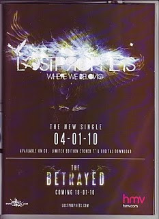
The contrast between colours in the advertisement creates a dramatic effect as the harsh black background illuminates the stark white text. The use of black conforms to stereotypes and conventions associated with the genre of the music which will attract listeners of the genre. The only other colour used is on the HMV logo which is bright pink and stands out, this is partly because it is a company logo and can not be changed but it could also be argued that the endorsement of such a big company enhances the product and also helps show that the product being advertised is an album.
The context within the advertisement is minimalist and simplistic but provides the vital information in order to advertise
the product. The most eye-catching information is the band name and title of the album which immediately draws the attention of the reader. This not only stands out through use of colour but also through the arti
 stic typography which shows images of birds and wings.
This imagery is significant to the band as it is a reo
 ccurring symbol that is shown through all of their albums and as part of their band logo. By using a reoccurring image it makes the audience associate the symbol with the band forming a connection.
Other information displayed in the advertisement is the release date of the single which is in large writing so the important information is easily absorbed, above this in smaller writing is the description of the product (the new single), this makes the information very clear to understand and leaves no room for misinterpretation. This could also be displayed because the bands album is also advertised on the same page and by writing this above the date it is clear that it is in relation to the single. Another way the single and the album information is clearly separated is by a single white line which splits the information into two halves and is shown almost as a subtitle giving the main priority to the single. Displaying the two products on the same advert is cost effective as it saves the need for a second advertisement which would be very expensive.
The layout of the advertisement is visually pleasing not only due to the text and separation of the page but also because of the simplistic appearance and empty spaces. These blank areas could be seen as a waste of space, however they make the information easy to absorb as the reader is not bombarded with clutter and useless information.
Overall I think this advertisement is suited to its target market due to the overall appearance and the magazine it is featured in. I think the main success is that the information is ‘to the point’ which makes the reader more willing to absorb it. This is something I will consider when making my own magazine advertisement.
Monday, 1 November 2010
Textual Analysis Music Videos - Rihanna, Rehab
This song is performed by a solo artist instead of a band like the other two videos I have studied, the difference between styles of artists may be reflected in the style of video. The song was written by another famous solo artist, Justin Timberlake inspired by his hurtful relationship. The video is in a cameo style, with the artist and songwriter both appearing as main characters. The reason for this style choice may be because the collaboration of two solo artists intrigues the audience, it could also be because both artists want their contributions shown as they are proud of the outcome. The cameo style of this video is a contrast to the Arctic Monkey’s but similar to the Example video.
The mise-on-scene used in this video contributes to creating an unusual and unique feel to the narrative. The location of the video changes form one extreme to another, the first shot reveals one of the two main locations which is in an enclosed room.  This location is normally only shown when focusing on her rather than him, perhaps to represent that she is trapped. The location then changes to a vast open space with no one but the two characters, the use of open space shows the characters isolation and the sunlight provides a good contrast to the other enclosed location.
 This vast location is juxtaposition to the Example video and the use of daylight is juxtaposition to the Arctic Monkey’s video. However, this video uses large mountains and miles of desert to make the characters seem isolated and insignificant which is similar in comparison to how the director of the Arctic Monkey’s video used the tall buildings to make the drummer seem isolated and vulnerable. The isolation of the two characters in this video shows the connection and focus between them.
 This location is normally only shown when focusing on her rather than him, perhaps to represent that she is trapped. The location then changes to a vast open space with no one but the two characters, the use of open space shows the characters isolation and the sunlight provides a good contrast to the other enclosed location.
 This vast location is juxtaposition to the Example video and the use of daylight is juxtaposition to the Arctic Monkey’s video. However, this video uses large mountains and miles of desert to make the characters seem isolated and insignificant which is similar in comparison to how the director of the Arctic Monkey’s video used the tall buildings to make the drummer seem isolated and vulnerable. The isolation of the two characters in this video shows the connection and focus between them.
 Props used within the location are used to help support the narrative, there are no musical props or microphones as the style is not a performance. The first main noticeable props used are the car and motorbike,
 the two juxtapose each other which may be a reflection of the differences between characters, these props may also be used to show independence from each character. Another prop used is the shower which seems surreal in its placing and use, however the reason for it is to show sexual tension between the characters, this is something that I haven’t seen used in the other two video’s I have studied as their narratives were very different. However, the Arctic Monkeys video does show images of water to represent the emotions of the character as well as building tension which is a similar use of the technique but with different outcomes. The trailer is used as part of a prop in the open location and also becomes a location when the shots change to the second location. The trailer looks quirky which is a theme that runs throughout the video. This excentrique theme is also shown through the use of fake flamingos which have no relation with the narrative and seem bizarre. These quirky props could be for effect or they could be to show that the imagery is part of a dream sequence and is not reflecting reality. The clothing used in the video is sometimes also excentrique but follows modern fashion for the time the video was released. The clothing is changed a lot throughout the video which is a contrast to the other videos I have analysed, the reason for these changes could be to symbolise the change in mood and narrative.

 the two juxtapose each other which may be a reflection of the differences between characters, these props may also be used to show independence from each character. Another prop used is the shower which seems surreal in its placing and use, however the reason for it is to show sexual tension between the characters, this is something that I haven’t seen used in the other two video’s I have studied as their narratives were very different. However, the Arctic Monkeys video does show images of water to represent the emotions of the character as well as building tension which is a similar use of the technique but with different outcomes. The trailer is used as part of a prop in the open location and also becomes a location when the shots change to the second location. The trailer looks quirky which is a theme that runs throughout the video. This excentrique theme is also shown through the use of fake flamingos which have no relation with the narrative and seem bizarre. These quirky props could be for effect or they could be to show that the imagery is part of a dream sequence and is not reflecting reality. The clothing used in the video is sometimes also excentrique but follows modern fashion for the time the video was released. The clothing is changed a lot throughout the video which is a contrast to the other videos I have analysed, the reason for these changes could be to symbolise the change in mood and narrative.
The colour used within the mise-on-scene is very bright and colourful in some clothing and scenes with the open landscape location, however, this location also cuts to black and white which is a huge contrast, the cuts between the two colours often happen whilst the imagery stays the same. 
 This could represent the ups and downs of the relationship and possibly the confusion of feelings. When the imagery is shown in the other location, there is a purple colourwash, these scenes often only show the female character so the colourwash could be to show her emotions and also to distinguish between the two locations.

 This could represent the ups and downs of the relationship and possibly the confusion of feelings. When the imagery is shown in the other location, there is a purple colourwash, these scenes often only show the female character so the colourwash could be to show her emotions and also to distinguish between the two locations.
 The narrative of the music video is not obvious because of the surreal imagery used along with different colour effects and probs. The lyrics of the song would suggest that it tells a story of a broken relationship or an obsessive relationship which is reflected in the imagery, however, the video is open to interpretation as this is not an obvious storyline, there could also be confusion as to whether the narrative is part of a dream sequence or reality because of its surreal imagery. This is also the case with the Arctic Monkey’s video but not the Example video. By leaving the narrative open to interpretation, the audience can find it easier to adapt it to something that they can relate to. The song was written by Justin Timberlake who appears in the video and it is likely that the song is based upon his brake up from a relationship with Britney Spears as the connections to rehab would relate to her lifestyle.
There is a wide range of camera work used as there are many quick cuts between shots. There are many low angle shots used when focusing on characters, in particular Rhianna this shows her importance and is also an aesthetically pleasing angle, this shot is also used a lot in the Arctic Monkeys video to show admiration for the character which could be the reason for its use here. The camera work often uses the rule of thirds in the imagery which is a convention often used in music videos. The director uses long shots to show the location or a character in the background, however, the majority of the shots are close ups to show the relationship between the characters and the individual emotions, a few shots cut the image short which looks abstract and unplanned and adds to the quirkiness. This is similar to the Example video which uses many close ups to help create an abstract image. There are a lot of shots that show Rhianna in the foreground with Justin in the background, this could be to show the narrative is coming from her perspective. There is a lot of movement within the camerawork not only through pans, tilts and zooms but also through handheld shots that are not steady, this may be done to reflect the primitive surroundings and is not a technique that has been used in the other videos I have analysed.
At the start of the music video the editing uses fast paced cuts to change between the vast variety of shots, it does this using very few transition shots. These quick cuts between shots could represent the confusion in her thought pattern as she can not gather her thoughts productively due to her emotions, this changes as the music progresses when shots stay on for longer and transitions are used such as slow cross dissolves. The shots are cut in time to the music but do not go off san obvious beat such as the Example video, however, the cuts are still made to the tempo of the song. Another editing effect is on some of the black and white shots, the image is speckled to make it look aged, this could simply be for effect or it could be to reinforce the abstract take on the narrative.
 changes as the music progresses when shots stay on for longer and transitions are used such as slow cross dissolves. The shots are cut in time to the music but do not go off san obvious beat such as the Example video, however, the cuts are still made to the tempo of the song. Another editing effect is on some of the black and white shots, the image is speckled to make it look aged, this could simply be for effect or it could be to reinforce the abstract take on the narrative.
 The tempo of the song compliments the narrative as it is fairly slow which allows time to show the characters reflections. At the beginning of the video, there is no music playing and no other sounds at the very start, this shows the isolation of the location which reflects that the narrative is based around them and no one else. The sound of chimes is then introduced which sounds relaxing which is then interrupted with the sound of a motorbike just before the music kicks in. The sound of chimes was also used in the Arctic Monkeys video along with the imagery of water, this created a bizarre image. The Arctic Monkey’s video also did not introduce the song straight away and had distant sounds like this video which was also used to show the isolation of the character.
Overall this video represents a broken relationship that is portrayed through the use of abstract imagery. It conforms to certain conventions such as the cameo style and the use of the rule of thirds but also brakes conventions due to the unclear storyline and strange imagery. The main influences that I will take away from analysing this video when creating my own is the use of colour and the inspirational location. I also like the song as a possible choice for my own video as it is open to interpretation.
Subscribe to:
Posts (Atom)